
Reflection Looks Good
Every good studio hits a moment when the tone shifts, when the work laps the branding, but you’re too busy making good things to notice you’ve outgrown your own look.
At Rendered, we stumbled into that moment a few runs ago.
“Over time, our visual identity started to feel a bit dated compared to the level of work we were doing,” our founder, Nate explains, adding “We needed a brand that matched the confidence people feel when they open a box of finished goods from us.”
So, we asked ourselves, what defines us now, and who can help us get there?
Enter The Young Jerks.
Finding the Right Fit
The choice wasn’t random, nor was it purely strategic. “We chose Young Jerks because they are, in many ways, our ideal customer: a design-led studio that cares deeply about craft, typography, and character,” our founder, Nate, explains.
Self-described as “hyper-intelligent golden retrievers,” The Young Jerks are a team of designers, illustrators, and letterers led by a couple of Dans (Cassaro and Christofferson). Like us, they work with big and small brands without losing the intentional human touch that makes for real design greatness.
If Rendered is a print shop built for creatives, The Young Jerks is the design studio built for people who talk in typefaces and think in textures.
We’d admired their work for a while, their ability to balance fun, nostalgia, and timelessness. And, we wanted a partner who could bring that same sensibility to a merch-first business like us.
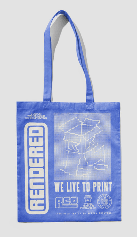
Made with the Right People
From the very first call, something clicked.
We explained that this wasn’t a vanity refresh. We needed an identity that could match the quality of the work and articulate our story in a way the old system didn’t. Rendered is tailor-made for creatives, and the brand needed to reflect that: timeless, approachable, and precise.
The Young Jerks understood both the under-the-hood mechanics of strong identity systems and the emotional side of how a brand should feel to other creatives.
Our founder, Nate, put it simply, “Collaborating with a studio that we ourselves would want to hire as a client felt like the most honest way to build a brand that speaks directly to the people we’re trying to reach.”
It doesn’t get more maker-to-maker than that.
Speaking the Same Visual Language
The Young Jerks felt it too.
“Rendered’s small, tight-knit team reminded us so much of ourselves. The dynamic between them made the process feel like exploring a design language we were already aligned on.”
See, we came in with taste and trust–they said it not us–while the Young Jerks brought clarity and craft. Both of us spoke fluent maker.
When we shared our early moodboards with them, it was clear we’d made a solid choice.
“For a visually driven client like Rendered, those were very insightful–not because they spelled out exact answers, but because of the valuable window into their taste. It felt like we were already speaking the same language from the start.” The Young Jerks explained.
From the jump, both teams aligned on the core tension:
- precision vs. play
- clean vs. charming
- professional vs. human
The Young Jerks summed it up, “Early on, we realized that the main challenge would be balancing what could be two worlds–clean, precise, professional work and unique, human, handmade work. We wanted to inspire trust without losing texture, represent order without losing warmth. The goal became to capture that balance without having to pick one side.”
The right team and a noble quest. Was it all too easy? No way. But also…maybe.
The Visual Cul de Sac: A Little 1974, A Little 2025
Our final identity lands in that sweet spot where nostalgia and modernism become fast friends.
Think:
- Tactile mid-70s-Inspired illustration
- Contemporary-nostalgic type you want to pet
- Schoolhouse Rock energy.
- Curvy marks and lil characters that feel like they crawled off an M&R Cobra Auto Press.
The brand book leans in, “Let your freak flag fly! Use type and illustration to create a charming and inviting texture.”
And the even better line:
“Use at will! Have fun with it. Your brand is playful and oh-so human.”
Made for Merch? Just our style.
A visual identity that actually likes being printed and embroidered? If anyone knows how rare that is, it’s us. But this system was built for merch.
Some identities fight the blank space of a t-shirt; this one settles right in, layering naturally across AS Colour tees and sweats, Weld MFG hats, custom totes, and whatever else we throw at it. It lets us mix marks, type, illustration, and texture in ways that feel intentional instead of chaotic.
For a screen printing and embroidery studio, that’s gold.
What the Collaboration Felt Like From the Inside.
Design lore tells us (in hushed tones) that rebrands are a nightmare, including several moments of mutual panic and at least one emergency meeting where everyone says, “What if we…didn’t?”
This wasn’t that.
Were there a few surprises along the way? Sure, but they were the fun kind.
“One of the most unexpected choices was leaning into smaller, textural elements rather than larger bold ones. We found that layering these details created a more tactile feel that aligned charmingly with the goal of blending precision and playfulness. It wasn’t the obvious path at first, but it helped bring out the handmade warmth they embody.”
Luckily, we both came into the project with clarity: We knew what we wanted to feel. They knew how to build it. The result was a process that moved quickly and felt collaborative, rather than prescriptive.
The Young Jerks put it this way:
“Their openness meant there was wide room for exploration and their decisiveness meant that once selected, ideas could move quickly.”
It brought so much mutual trust and respect that can be felt in the final designs. “We went into this trusting The Young Jerks to bring something fresh and fun to life, and they delivered tenfold. On top of that, they made the whole process exciting, and we found ourselves looking forward to every new reveal as the project moved forward.” -Nate
How it Lands
The new Rendered identity is:
- timeless without being stiff,
- playful without being silly,
- designer-friendly without being exclusionary,
- and warm without losing precision.
Most importantly, it reflects the shop as it actually is: a small team that cares deeply about materials, process, and the people on the other side of the table.
The Young Jerks said it beautifully:
“We wanted the identity to feel like something people could join rather than just observe. The goal was always for it to cater to artists and designers through polished design work, but we used illustration as well to evoke community and an inside joke that clients can be a part of.”
And honestly? They nailed it.
Next Up? Merch, obviously. Keep your eyes on this space for an upcoming collab with Young Jerks.


